
My typical website design process consists of three key stages: 1) Consultancy. 2) Design. 3) Development. This particular post is a very practical one. It describes the second stage - a seven step visual design process. By this point in the process, the consultancy package has been signed off. This should ideally include agreed project and creative briefs, wireframes, prototypes, technical specifications, budgets, and timeframes. So where do you start with step two, and how do you get into the right frame of mind?
This post sets out what works for me in the majority of my projects. If you're at the stage of your career when every project is a struggle to get your head around before you start, this might help. Hopefully there's enough material and ideas here that with a few tweaks it might work for you too.
1. Fear of the Blank Page, or, Where to Begin?
Following a tried-and-tested process should help to eliminate The Fear of The Blank Page.
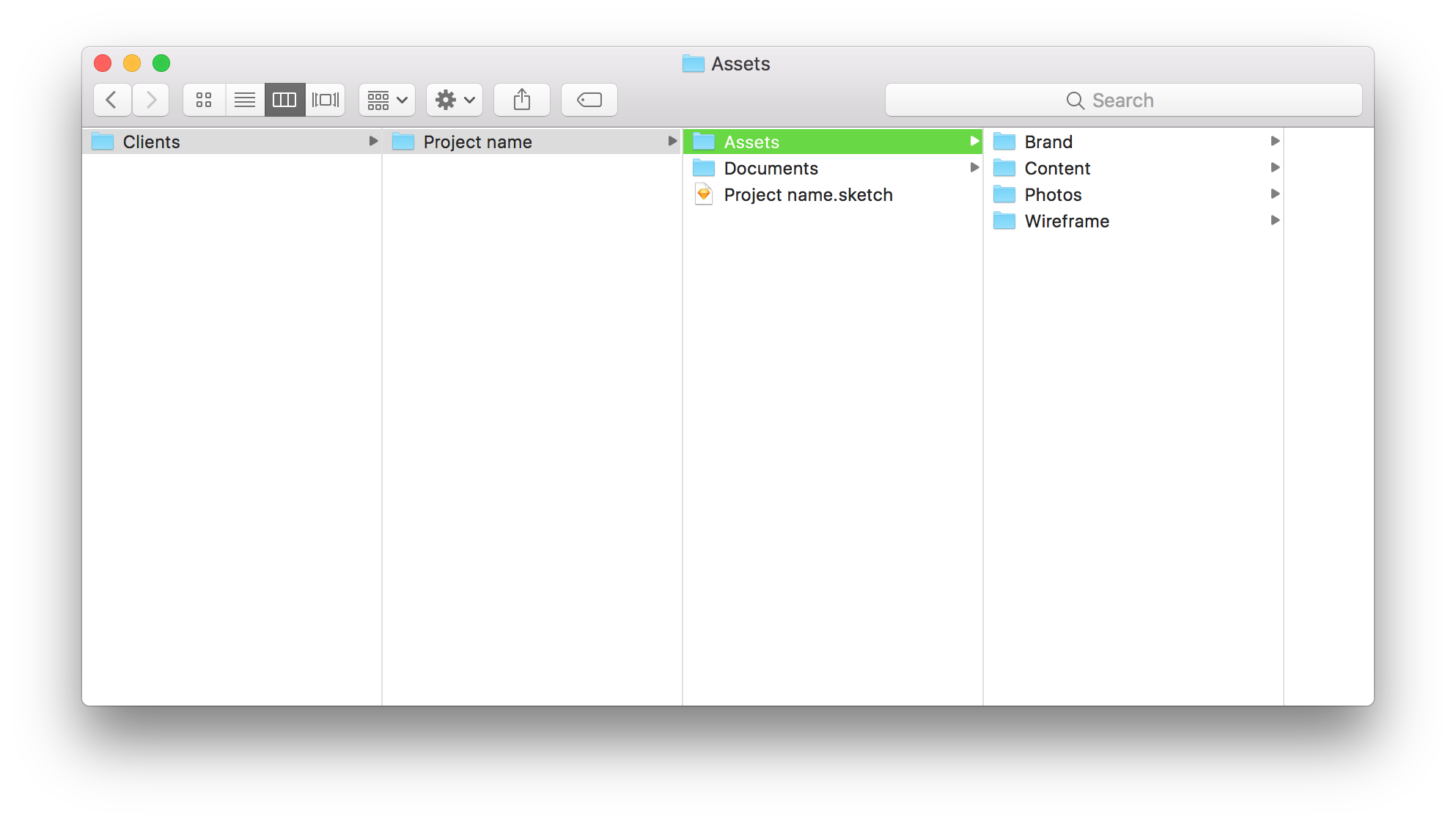
So before you start — get organised. Create a project folder and get the design files ready. Create an "Assets" folder in there too for all your documents: wireframes, briefs, guidelines etc etc. Later on during the process, you'll also add all the other relevant documents in there, such as: images, content, graphics etc. It'll save you time later on.
Read through the brief carefully. Specifically the part about the look and feel of the required design. Note what your client likes, dislikes, and any other specifics required for the presentation. Make notes about potential colours, fonts, imagery, and overall styles that might convey that message. Have a solid idea of what your primary option will be and stick to your client's requirements closely. And then think of an alternative of how you might improve things if some of the requirements were more flexible.
2. Set Your Mobile & Desktop Grids
Grids are super helpful and should be set up and followed. It will help the developed website to match your design. I usually stick to the 12 column default desktop grid in addition to the mobile one used in Bootstrap Framework. That's only my preference because this is the one most used by the developers I work with.
Some projects require a different, more fluid grid which can make for a more unique and premium look and feel. I find that those tend to entail more time and budget, specifically during development. So make sure your client and your developers are on the same page when a more customised approach is required. If in doubt, stick to the basics to avoid complications further on. Talk to your developer and your project manager if you have people working on the project in those roles.
3. Typography
The fundamental purpose of any website is to convey information. Information is communicated through language. And language requires typography - it is the basic unit of your design. Get this right and that might be all that your client needs. The rest of the design are just wants. You might want to use brand colours and other design elements to convey the message in the right way, with the right emotions, associations, feelings, etc - but they shouldn't get in the way of information.
Check if the brief requires you to stick to a specific set of fonts, and follow those guidelines (make sure the client has a web licence to use those fonts online).
If your client is open to new font ideas, refer to the brief again and check Google Fonts (or a premium service if you've got one, such as Typekit) for the right font combination that would help convey the required message. A more characterful typeface might need a separate client sign off before you go any further. And if your client's existing brand fonts are too heavy for web use, suggest a web friendly alternative.
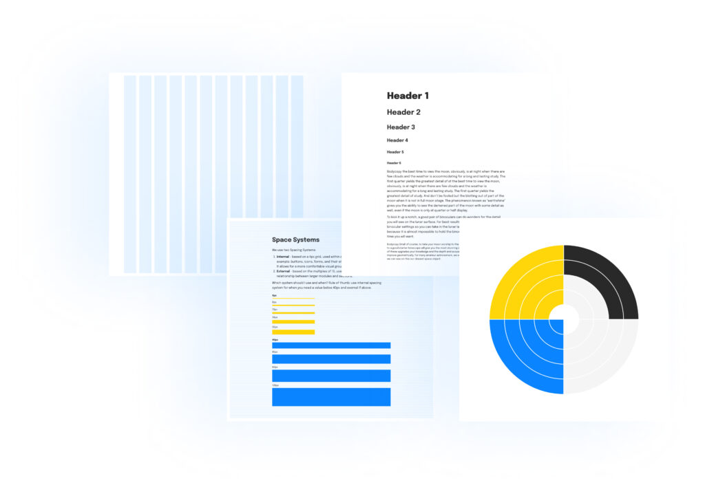
Setting the Type
Setting the basic typography and connecting your visuals to a developer’s code can be time consuming and tricksy. I recommend starting with code using either Type Scale (for simpler websites) or Modular Scale (for larger projects), and then taking screenshots and recreating it in your design tool (Sketch, Figma, Adobe XD, probably not Photoshop).
Luckily for you, I’ve done the hard bit and got a freebie ready for you to download and use for Sketch and Figma. So you just need to pick the fonts, update the styles and stick to the relative scale font sizes provided. It will ensure your typography is set right, looks good, and that your developer is happy as well.
Stick to as few font styles as possible and only add new ones when absolutely required. My rule of thumb is that a new font style has to be used at least a few times throughout the design to justify its existence. I usually have different styles for h1—h5, p, quote, and small p (for captions, breadcrumbs, footer text etc). Some of those would have an inverted version for dark backgrounds. And if you use all caps versions for some of those — you'll have a big variety of font styles to choose from without having to create random one offs.
Sketch Starter Template
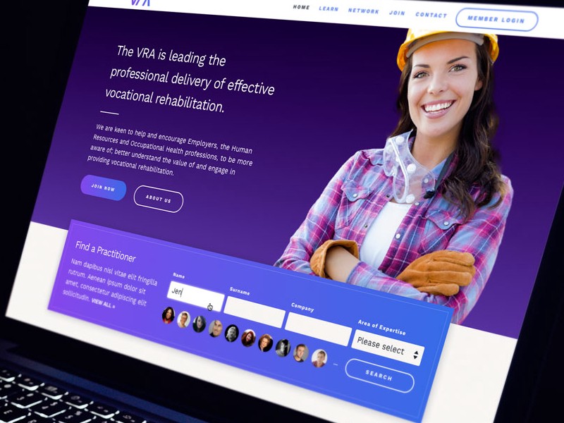
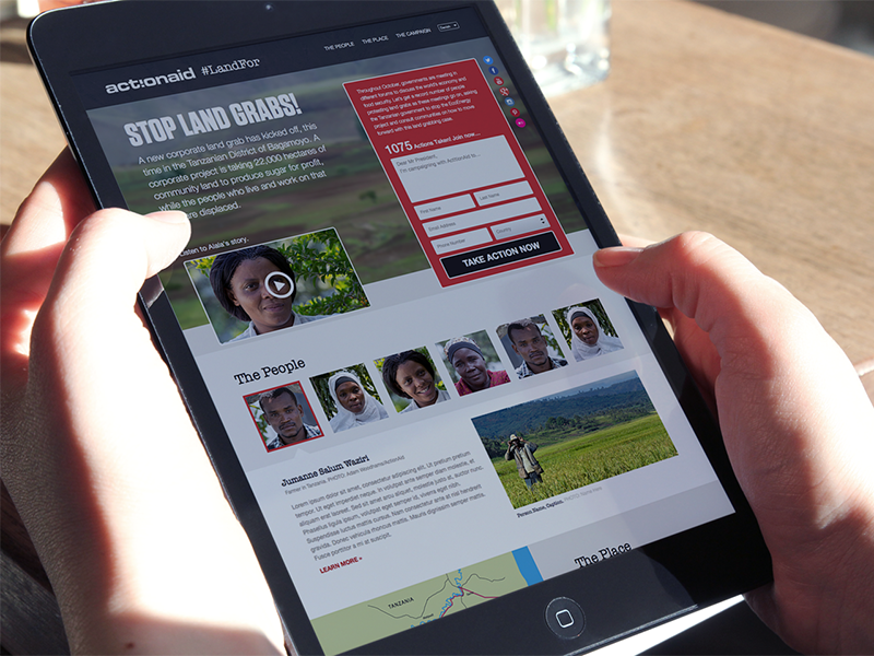
4. Logo, Colours, and Other Design Assets
Go through the creative brief and (if you've got it) the brand guidelines document once again. Research your client's current website, as well as those of their competitors, and think about any interesting pieces of content or design elements that might work well.
Browse though some inspirational websites such as Behance or Dribble and pick out visual cues that might be helpful for your project to convey the right message.
Find a vector logo, relevant colour combinations (expand those for web if necessary using Adobe Color CC), fonts, illustrations, icons, images, messages to convey, catchy titles, USPs, tone of voice.
I throw all of those elements onto my canvas and reflect on them, thinking about how they might be combined to answer the brief.
5. Working Fast
By now you've done the hard bit and can start fleshing out your wireframe quickly.
You don't have to start from the header and finish with the footer (although that is the general direction). If you happen to have a great idea of how to present a specific type of content, do that first. Present the key information in the most engaging way possible. And then build around it, supporting the key messages and calls to actions. Combine type and images in various ways, try different colour combinations. Put it all together, refine, rinse, and repeat (and repeat and repeat...).
Don't do anything too subtle if it means it'll increase the development time exponentially. On the other hand, do polish the details of the key interactive areas and main messages. Try to make the most impact using the least means.
Use your budget wisely. Spend more time coming up with a great idea for the key feature. But don't waste time on things that are irrelevant or relatively tiny. Use that time to execute the initial idea well. Try to get to a meaningful presentation ready design first before trying out other "little things."
6. Presenting Your Design
Don't overlook how you might present your designs in a way that gets the best out of them - it can make or break the project. Ideally, you want to present them face-to-face so that you can have full control over your ideas and avoid misinterpretation. Talk about how the design elements you've chosen answer the creative brief requirements. Use Skype or Google Hangout if face-to-face is not possible or out of budget. Whatever you do, don't just bombard your client with PNGs.
7. Design Handover
The importance of the design-to-development meeting can't be overstated. If someone else rather will code your design, make sure they have time to go through each screen, ask questions, and get answers.
Inspect by InVision
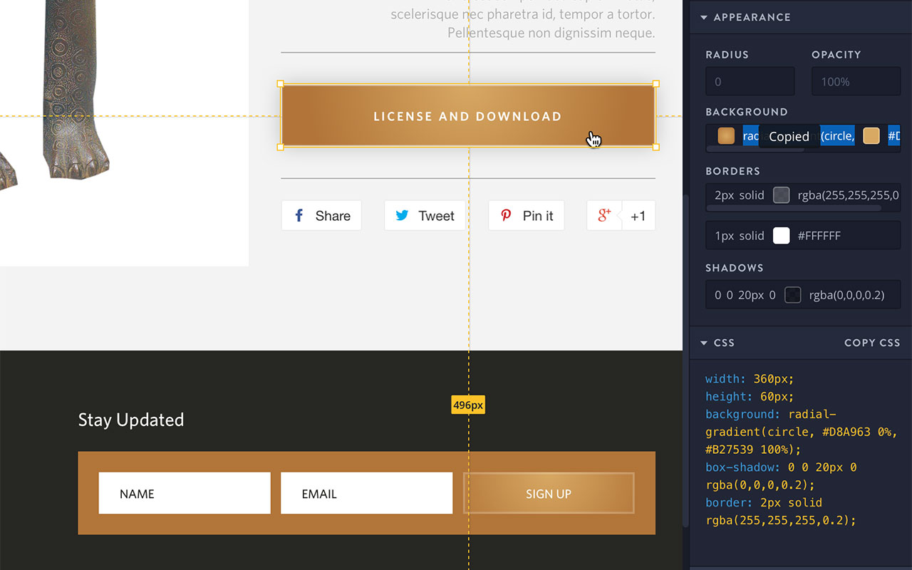
Whilst writing this article, a fantastic new design to development workflow solution was launched (Inspect by InVision). Inspect bridges the gap between design and development even further. This tool allows your developer to access your design files in their browser without opening a design program ever again!
That means they can see and copy all the measurements, colours, font styles, css, and even your buttons' complex gradient backgrounds with one click, and, of course, download visual assets as well. And all you have to do is just sync your design into InVision as you work on them. No more "can you send me that sketch file please?", "is it the latest version?", "the fonts look funny..." and so on, saving time for you and for your developer.
I would recommend you, your developer, and your project manager have InVision Inspect open during the meeting as you go through the files.
Also note that, during the handover meeting, it is inevitable that a few things will come up that might have to be tweaked in your design files such as: design consistency and UX errors, technical solutions available, and budget constraints.
Conclusion
You haven noticed that the actual design work here mostly happens at point 5. I find it extremely important not to jump ahead or fast forward your process straight to that step. Because, if you do, there's a good chance you'll have to go back a few times which will waste your time, your client's time and cause a lot of frustration for you both. The client will feel like you didn't listen to them from the get go, and you'll have to spend a lot of time oscillating between trial and error. You'll be forced to try different layouts, colour palettes, fonts, assets, wasting a lot of time and budget in vain. (We've all been there.)
So next time you sit in front of the blank canvas overwhelmed by all the information and work ahead, DO NOT PANIC. Just try following these steps, one step at a time. Done enough times, deviations and innovations will become helpful, and an approach will emerge that she suited to your quirks and way of working. But get the basics right first.
Design Resources
- Website Design Style Guide for Sketch and Figma. (Updated July 2022)
- Type Scale, Modular Scale, Typecast
- Color Safe
- Sketch
- Figma
- Google Fonts or Typekit
- InVision App

 London /